Something familiar in the new Sky TV ads
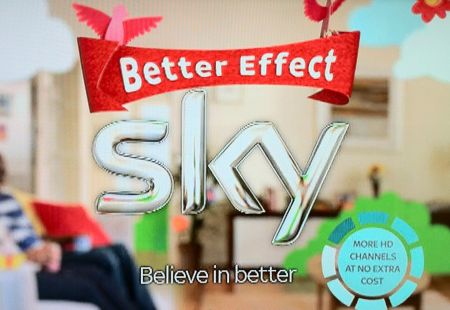
Sky’s just launched a new advertising campaign – an extension of its “Believe in Better” catchphrase. Watching the ad several times today, the team at Radio and Telly HQ couldn’t help noticing something familiar in the logo at the end of the latest Sky TV ad.
Here’s a screenshot from the end of the advert:

Sky's ad campaign from May 2011
Now, take a look at this logo:

Is it an accident that Sky’s latest TV ad has the phrase “Better Effect” in a style very similar to a certain digital TV service’s logo? A deliberate ploy to subliminally link Sky with a free-to-view service, or are we just imagining it?
Let us know in the comments below, so we can decide here whether we’re going mad or not!


Personally my eyes glaze over whenever anything about Sky appears. But I do see your point here….I agree with you.
Innocently, you might argue that they have conducted hours of pain-staking market research and in-the-field testing with thousands of focus groups, and concluded that a jaunty white on red scroll is the best means of conveying their message.
Cynically, you could say they think the buying public are idiots, and that by aping the competition, they hope to confuse their potential customer base sufficiently so as to ensure any number of mistaken sales.
It has to be deliberate. It’s typical Sky tactics. Will anyone be fooled? I doubt it.
what has happened to the TBA channel ?
“Pain-staking”, DAD? What, more vampires?
Sky scum…
typical of sky, better effect what do they mean?
i work for the agency who made the ads and I was involved directly in the design of the graphic elements. Its simply a banner, it appears in lots of different colours the red being one of the later incarnations of it. Far from being a sneaky subliminal work of evil I its purely coincidence. In fact had Sky noticed that the banner bore any resemblance to the freeview logo they would have made us change it in a flash.